Build business-oriented dynamic forms
One of the most important and challenging activities in any application is how you capture data. In Beezr, we’ve taken into consideration the need to create the right balance between simplicity and flexibility in our form designer. the Dynamic Forms module is rich with features that enable developers to match the business requirements quickly.
Creating a new form
Go to "Dynamic Forms" and select the module you want to work with. if there is no form defined, click "New Form"
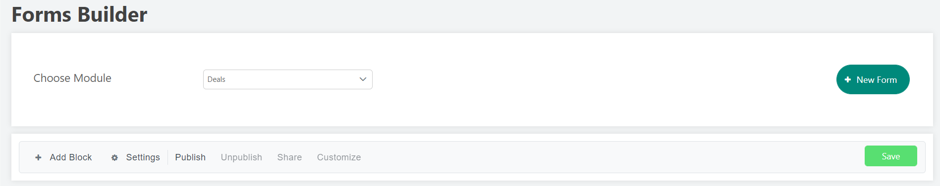
# Component Description 1 Add Block In Beezr you can divide the form into blocks like in label 3. This button allows you to create a new block in the form. 2 Settings Opens a panel that allows developers to add visibility and access rules on the form, more on that component later. 3 Block A block is a section in the form that hosts any number of fields. Each block has a title that defines the information group it holds. Fields are added to the block by drag and drop from the tree of the field on the left. The block title is mandatory and cannot be left empty.
You should add the block title as a label key to enable localization. 4 Fields When a module is chosen, the tree is populated by the fields defined in the Module. 5 Advanced Components A set of components that provide more functionalities over the fields, we will discuss these components in detail. 6 Publish Allows you to share the form with public users via a public link. 7 Unpublish Disable public access to the form. 8 Share Gives you the public link that you can use on either another webpage or directly share with public users. 9 Customize This option is available for public forms, where you can add your branding and style the form for public users to relate to your company.
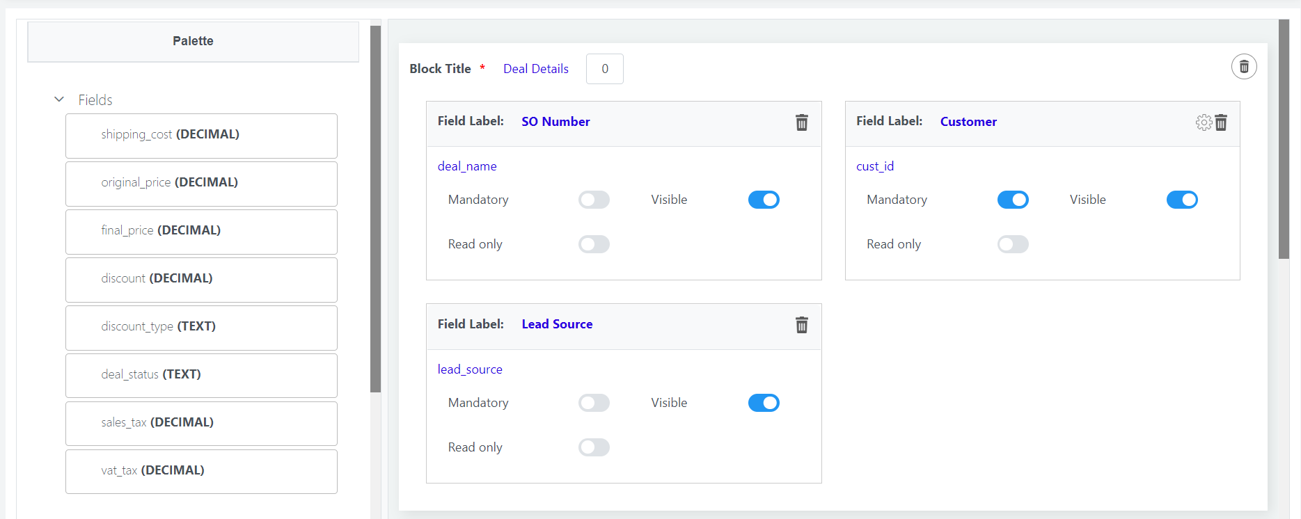
For relational fields, you will find a gear icon above the field which opens up further configuration.
Configuring relational modules
These configurations are optional. They provide more control over the form and advanced features that are useful to solve more business requirements.
Step-1:
- The default view of relational fields is a popup dialog that allows the user to search and select the related record.
- In some cases, the business prefers to show the related record as an autocomplete text field.
- The default number of records in the default view is 10 records per page, you can change that from here.
Step-2:
- You can control the records that a user can select from the related module.
- Add your conditions here to filter the data.
- Add double dollar signs and the true filed name from the form.
Step-3:
- Data mapping allows you to auto-fill the form fields based on the selected relational record.
- The right-hand side is a scripting field where you can add computational Beezl scripts or simply access certain fields from the related record. For example, you can write $address$ and map it to another field in the form automatically rather than asking the user to enter it manually.
- The left-hand side refers to the form field that the value should be mapped to.
Advanced Components
Sometimes a simple form is just not enough to fulfill the business requirement, that is why we’ve added a set of advanced components to derive more flexibility for the developer. As of now, we have 3 components developers can use:
# Component Description 1 Layout It is a component that acts as a holder to other advanced components, giving the developer power in how they are organized in a structured layout. 2 Button Through the button component, the developer can invoke actions, call flows and fetch data from other modules. It produces events that are used by other listeners in the form. 3 Table Load and create records inside the form. This allows you to have the power to do actions on the working module as well as other modules at the same time.
1. Layout
The Layout component represents how other components are aligned in a grid. The configuration of the Layout consists of one field:
Field Name Field Type Mandatory Description Number of Columns Integer Yes The number of columns the layout component grid should support.
Once the Layout is added to the Block, you can start dragging and dropping components in it.
2. Button
The configuration of the Button component consists of the following:
- Field Name Field Type Mandatory Description Button Label Text Yes A descriptive name of what the button represents. Button Position Integer Yes In the case that there are multiple buttons in a layout, you can control the order in which they are viewed. Styling Text No This field holds the styling CSS which you use to control how the button should look like. Disabled If Script No This is a Beezl scripting field where you can add checks on whether a condition is true or false. If the return is true then the button will be disabled and the user cannot click on it. Action Dropdown Yes The list of supported actions the button can invoke:Get Data
- Run Workflow
- Open Page
- Dynamic form
- Data Entry
- Barcode Scanner
Click Event Name Text Yes The event name whenever the button is invoked. This name is used by event listeners to take other actions. Below are the configurations for different actions: Get Data Field Name Field Type Mandatory Description Module Dropdown Yes In the list of Modules, choose which Module you would like to get the data records from. Number of Records Int Yes The number of records per page. Filter Clause Text No Add a clause to filter the data records retrieved if needed. It has to start with the keyword “WHERE” Custom Sorting Config No Choose a default sorting for the table. Open Page/Dynamic Form Field Name Field Type Mandatory Description Module Dropdown Yes In the list of Modules, choose which Module you would like to get the data records from. Parameter Key: $Value$ No When opening a page, you might need to pass the get parameters. This is where you define the URL parameters and values, the value also supports Beezl to compute the value dynamically.
the left-hand side field is the field name in the target form/module. while the right-hand side is the value you want to pass to the form. For the value, if it's a dynamic value (coming from the record) the field name you want to access should be between $$, like this $field_name$ Data Entry Field Name Field Type Mandatory Description Click Event Name Text Yes The event listener name will be used later on the target table component. The event name should not contain spaces or special characters. Barcode Scanner Field Name Field Type Mandatory Description Module Dropdown Yes In the list of Modules, choose which Module you would like to get the data records from. Target Barcode Field Dropdown Yes The barcode field you configured in the target module from the previous configuration step. View Field Dropdown Yes When a barcode is detected from the camera, which descriptive name should Beezr show you? Image Field Dropdown Yes What is the reference image of the product to show you upon proper detection? This is helpful to validate if the camera detected the right product or not. Run Workflow Field Name Field Type Mandatory Description Workflow Dropdown Yes Choose the target workflow to run upon click.
3. Table
The configuration of the Table component consists of the following:

- Field Name Field Type Mandatory Description Binding Module Dropdown No Choose the Module you want to bind the table with. This is optional by default but is mandatory if you need to process the records in the table. Process Data Checkbox No This indicates if you need to insert the records in the table into the respective binding module. Deletable Records Checkbox No This identifies if the business user can delete the records added to the table. Duplicate Check Checkbox No Do not add or accept duplicated records in the table. Master Column Dropdown No The values of this list are populated when you choose a binding Module. It is mandatory to choose a master column if you choose to process the data in the table. Sort Column Dropdown No Custom sort column if required. Sort Type Dropdown No Custom sorting direction. Enable Filters Boolean No If required you can add filters on which data should be presented to the user in the table. This is helpful if you have more than one table directed to the same binding module but you want to represent different data filters for the tables. Number of records Integer Yes The number of records per page. Component Name Text Yes This is similar to the event name in the Button component and can be used by the event listeners to invoke reactive actions. Event Listeners Component No This is where you add the events from other components to configure reactive actions based on them for the table. Event Name Text Yes Add the event/component name from other components like buttons and tables. Event Type Dropdown Yes Specify the type of action this event should be interpreted as:Selection Event: This is used when you select records from another module.
- Data Entry: This is used when a new record is manually added to another table.
- Inherit Table Data: This is used when you need to mirror the values of another table.
- Refresh Data: When an event occurs, you need to refresh the values of the records in the current data to reflect any changes.
Add Column Button Yes Add columns to your table and configure them properly. Add Column 
- Binding Column Dropdown No If there is a bound Module to the table, then you can bind a table column to one of the Module fields. Column Label Text Yes This is the label of the table column the business user will see; you can use a key from the label manager. Column Order Spinner Yes The order of the table column. Data Map Component No If you have event listeners; you can bind the value of the column to another field value fetched from the activity values that happened in an event. Fr example: a record selection event from another Module. Visible Checkbox Yes Identifies if this column should be visible to the business user or not. Dynamic Column Checkbox Yes Identifies if the value of this column should be computed through a Beezl Script. When this field is checked; a smart script field appears to write the Beezl script. Styling Text No This field holds the stng CSS of which you use to control how the column should look like. Editable Column Checkbox Yes This identifiesthesethis column cells should be editable by the business user. Edit Type Dropdown No Choose the editable component if the column is editable.Input Field
- Spinner
- Lookup
- Boolean
- Relation
- Add Summary Column Add Summary Column Button No Add summary fields to your table.
 Remove Button No Removes the summary column. Binding Column Dropdown No If there is a bound Module to the table, then you can bind a table column to one of the Module fields. Column Label Text Yes This is the label of the table column the business user will see; you can use a key from the label manager. Column Span Spinner Yes The row span of the summary field. Column Order Spinner Yes The order of the table column. Data Map Text No Same idea as the data map in the column definition, the difference here is that you can map only to column values in the current table and not to events. Aggregate Column Checkbox Yes This identifies if the value of the summary column should be an aggregated value of the data-mapped column. If you checked this field; a drop-down will appear to choose the aggregate function you want to use. Meta Column Checkbox No This field identifies if this field holds a value that is descriptive and has no value to the actual record. Dynamic Column Checkbox Yes Identifies if the value of this column should be computed through a Beezl Script. When this field is checked; a smart script field appears to write the Beezl script. Editable Column Checkbox Yes This identifies if this column cells should be editable by the business user. Edit Type Dropdown No Choose the editable component if the column is editable.Input Field
 - Spinner
- Lookup
- Boolean
- Relation